| Self Organizing Maps [message #603] |
Thu, 08 August 2019 18:58 |
 hungerfordwm
Messages: 2
Registered: March 2019
|
Junior Member |
|
|
 Thomas, Thomas,
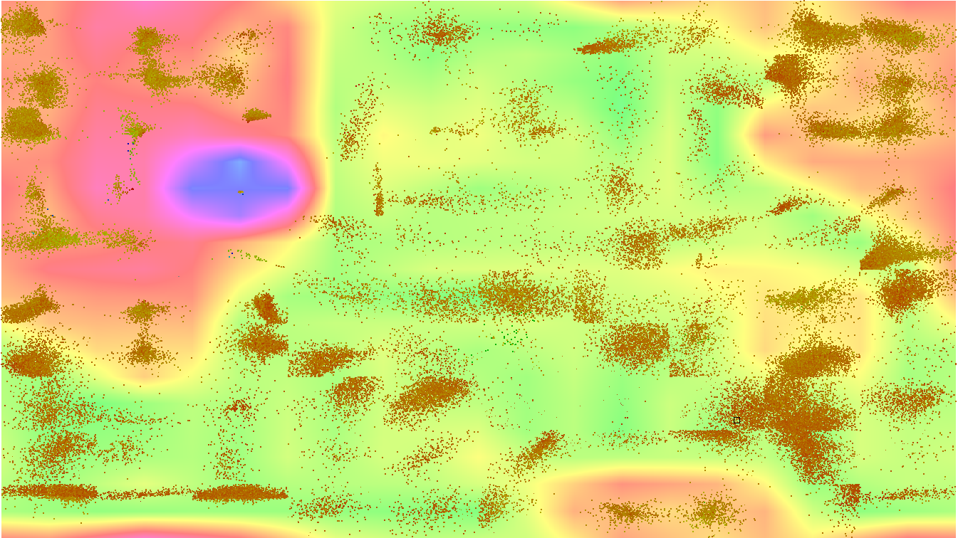
I successfully have a self organizing map comparing the diversity of over 200,000 compounds based on Structure [FragFp]. I see where the structures are clustering. However, I do not understand the SOM Fit color scale of the individual compounds and what that means. Nor do I understand the color scale of the background 3D image and what that means. Presumably, the color scale of the background 3D image refers to the cliffs and valleys of the available chemical diversity space, but I'm not sure. Any further clarification as to how to interpret the data that I have generated would be most appreciated.
|
|
|
|
 Search
 Help
Help Members
 Register
 Login
Login Home
Home


")
